Visualising data with KQL
Let's explore how you can visualise your KQL data.

Ever struggled to make sense of endless rows of raw data? With Kusto Query Language (KQL), you don’t have to. Built-in data visualisation tools allow you to turn complex datasets into intuitive charts and graphs, making insights easier to grasp and share. Read on to explore how to harness these features and take your data storytelling to the next level.
What is data visualisation in KQL
Kusto Query Language (KQL) has data visualisation capabilities built into the language. So you can turn raw data into graphical representations. This can include charts, graphs, and other visual formats that make the data more comprehensible and actionable.
With this feature, it means you can start to build out Azure Monitor workbooks or Azure Dashboards visualisations to help make the raw data more accessible to a wider audience and easier to understand at a quick glance.
KQL Render Operator
The render operator within the KQL language has eleven different options for rendering your data.
- Anomaly Chart
- Area Chart
- Bar Chart
- Card
- Column Chart
- Line Chart
- Pie Chart
- Scatter Chart
- Stacked Area Chart
- Table
- Time Chart
The render operator should be the last operator used in any of your queries. It can only be used with queries that produce a single tabular data stream result. The render operator doesn’t modify the data; instead, it injects a visualisation into the query result’s extended properties.
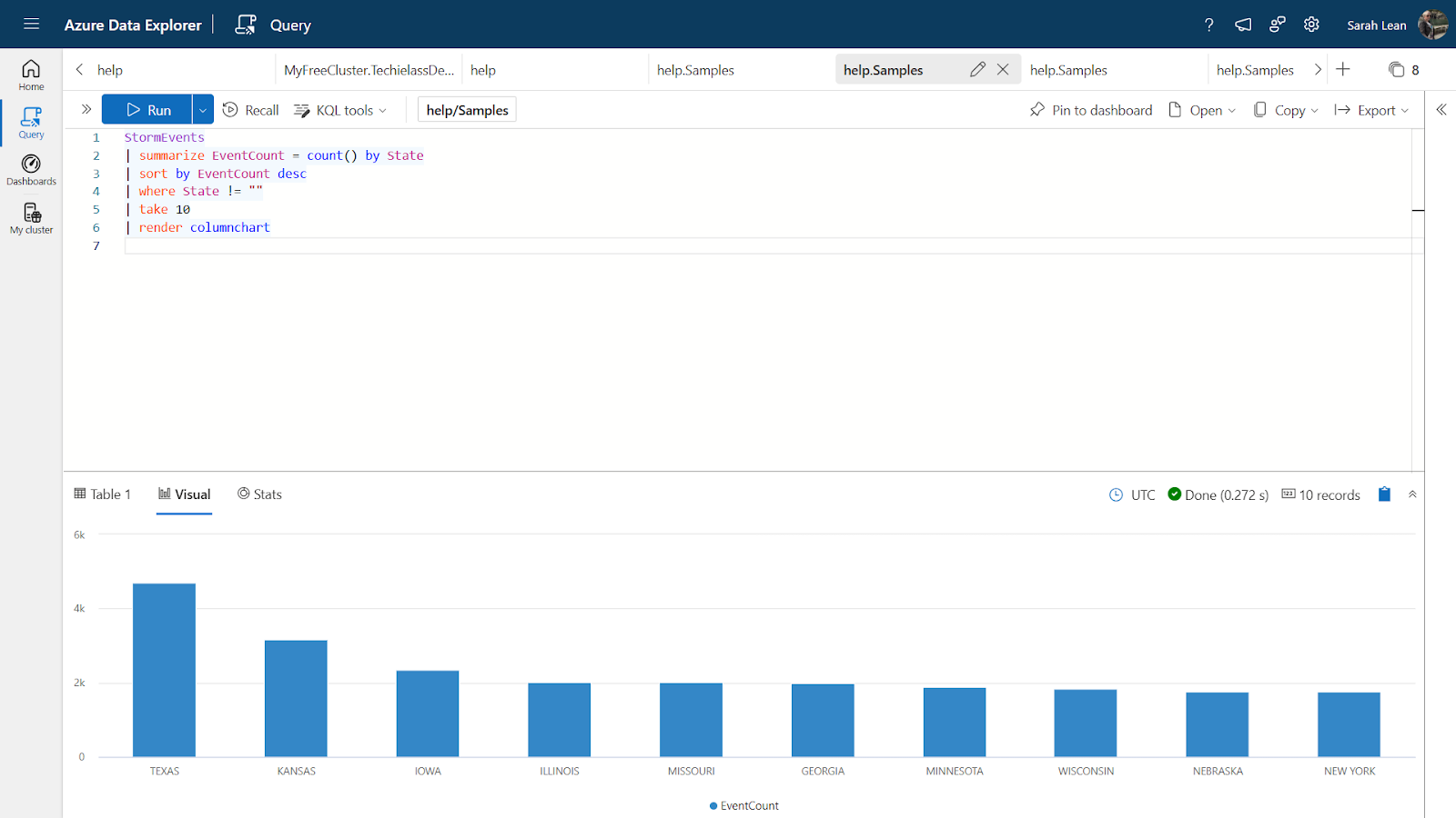
An example query would be:
StormEvents
| summarize EventCount = count() by State
| sort by EventCount desc
| where State != ""
| take 10
| render columnchart
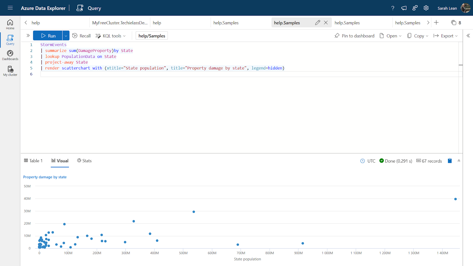
Other supported properties are optional for you to build your chart as well. If we look at the query below we can elaborate on the render line:
StormEvents
| summarize sum(DamageProperty)by State
| lookup PopulationData on State
| project-away State
| render scatterchart with (xtitle="State population", title="Property damage by state", legend=hidden)
The render line of the query carries out the following:
- Creates a scatter chart to visualise the data.
- X-axis (xtitle) represents the state population.
- Y-axis implicitly represents property damage (from DamageProperty).
- The chart title is set to "Property damage by state."
- The legend is hidden for a cleaner visualisation.
- Documenting your KQL queries
- Understanding KQL functions
- Understanding KQL operators
Data visualisation in PowerBI
While you can build Azure Monitor Workbooks or Azure Dashboards using the KQL queries and visualisations there are times when you might want to visualise the data in PowerBI.
You can pull data from your KQL databases or Azure Resource Graph from your Azure environment into a PowerBI report.
Check out the video tutorial showing you how to pull in Azure Resource Graph data into PowerBI.
Conclusion
KQL’s data visualisation capabilities open up a world of possibilities for transforming raw data into meaningful insights. Whether you’re using Azure Monitor Workbooks, Dashboards, or PowerBI, these tools make it easier to understand and communicate your data’s story.
Ready to dive deeper into KQL? Check out my other blogs for more tips and examples, and don’t forget to subscribe to stay updated with the latest content. Let’s unlock the full potential of your data together!